We are all familiar with the Hudson Explorer logo: a ship with stars above it. But where did it originate?
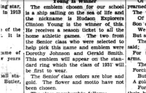
I set out to find where the Hudson ship and stars came from. It was a real mystery. The library didn’t have much history on it. I Googled it and there wasn’t much information found. So, I contacted the Hudson Historical Society. Not much there either! What they did find was an article that was published in The Hudson Times Nov 6, 1930 on page 4. The article said that a student named Clinton Young won a school contest and designed the logo.

There are some beliefs that the logo represents the early settlers of Hudson. Hudson was named in 1837 after David Hudson who is described as a traveler and “explorer.” Another important person of the time was James W. Ellsworth, who built our famous clock tower in 1912. Does his name sound familiar? The grade school is named after him. His son, Lincoln Ellsworth was a well known Polar ‘Explorer’ – traveling to the arctic many times, which back then was a big deal. All of these explorers must have been part of the idea for a ship as the logo. The shape of the ship and the logo has had some changes over time, but the idea and basic look of our logo is almost 100 years old.
Since I couldn’t find much more about the logo’s history, I interviewed three people to find out what they knew about it and what it meant to them. First, I met with Mr Miller, the high school principal, because he is the leader of our school. Then Mr. Chuppa, the Athletic Director, because the logo is everywhere when it comes to our sports teams. Finally Mrs. Reece, Manager of Communications & Alumni Outreach, because she has the branding guide and knows the logo better than anyone.
So, what is the logo? You’ve all seen it. It depicts a sailing ship facing west, with six stars above it. Going west is often the direction early explorers sailed to discover new territories. Both Mr. Miller and Mrs. Reece reported the 6 stars represent the original 6 district buildings for Hudson. The colors used are the school colors of blue and white. It is a very simple design but has a lot of meanings behind it. According to Mr. Miller, another part of the ship is the line on the bottom, representing water, showing the ship going forward.
So that’s what the logo looks like, but what does it symbolize? The definition found in Merriam Webster says, “an explorer is a person who travels in search of geographical or scientific information.” That makes sense for a school, to search for knowledge and explore new things. According to Reece, “it also means our students are exploring. It’s also a reason for them to rise to their full potential.”
No matter where you turn in Hudson, you will always see the ship. It is in the main office, the auditorium, even the online Home Access Center. You see it on the stadium field, and team uniforms. Noted by Miller, “I think it’s important to have something recognizable, and to have pride in.” This pride can be seen in every club, team and sports symbols at Hudson. Chuppa added. “I love seeing it on our uniforms, and it’s a symbol of pride.” Who knows where we might see it next? Maybe it’ll be on a new stadium scoreboard.
The ship and stars logo is very unique to Hudson. There’s no other school around us that has a design like this. Chuppa stated, “I think it stands out quite a bit because it’s not a knight, a dog, or a tiger, or anything else like that.”
Miller states that, “In a way, the ship is our mascot. I would say it’s recognizable to northeast Ohio. People in this area know who we are.” It is something that our community can get behind and something we can be proud of. Not just a school, but as a community as a whole.
Mystery solved! Now you know all about the ship logo! Go Explorers!


